Let me tell you, designing a kick-butt product page that convinces people to whip out their wallets is no cakewalk. As an ecommerce business owner, I’ve spent countless hours obsessing over every little detail of those puppies – from the hero image to the description to the calls to action.
I’ve poured blood, sweat and tears into crafting product pages that inform customers and persuade them to buy my wares. And through trial and error (so many errors!), I’ve learned what works and what makes visitors hit the ol’ back button faster than you can say “bounce rate”.
So, if you want to design a stellar product page that transforms lookie-loos into paying customers, stick with me, friend. I will share my hard-won secrets on creating product pages that sell.
Contents
- 1 How to Create a Winning Product Page Design
- 2 What is a Product Page?
- 3 Key Elements of an Effective Product Page
- 4 Examples of Great Product Pages
- 5 Using High-Quality Product Images
- 6 Ensuring Above-the-Fold Content is Visually Appealing
- 7 Using White Space Effectively
- 8 Choosing an Intuitive Layout
- 9 Highlighting Product Benefits and Differentiators
- 10 Using Persuasive Language
- 11 Optimizing Copy for SEO Keywords
- 12 Making the Page Easy to Scan and Navigate
- 13 Conducting A/B Tests on Page Elements
- 14 Analyzing Site Metrics to Identify Issues
- 15 Continuously Optimizing Based on Data and Feedback
- 16 The Purpose of Product Pages
- 17 FAQs
- 17.1 Q1: What are the most important elements of a product page?
- 17.2 Q2: How much text should be on a product page?
- 17.3 Q3: How can I make my product page stand out?
- 17.4 Q4: Should I include customer reviews on product pages?
- 17.5 Q5: What makes for effective call-to-action buttons?
- 17.6 Q6: How often should you update product pages?
- 18 Conclusion
How to Create a Winning Product Page Design
For killer product pages, start with strong visuals – great images sell. Then quickly convey why your product rocks using scannable descriptions focused on benefits. And include clear calls-to-action so customers can easily buy.
What is a Product Page?
A product page, also known as a product detail page, is a dedicated page on an ecommerce site that provides potential customers with in-depth information about a specific product. It allows shoppers to learn all about the product’s features, benefits, specs, pricing, options and more before making a purchase decision.
The product page contains the core sales-driving content that convinces shoppers to add that item to their cart. It combines product images, descriptive titles and copy, customer reviews, technical specifications, calls-to-action and other elements to form a comprehensive product view.
Key Elements of an Effective Product Page
An exceptional product page contains several key elements:
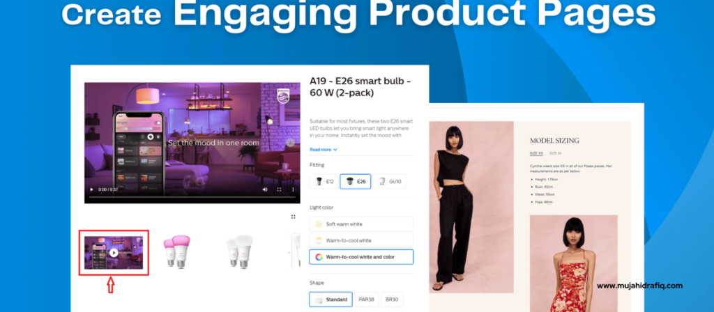
- High-quality product photos and videos that give customers a detailed look at the item. Using Zoom, alternate views and lifestyle imagery is ideal.
- A clear, descriptive product title that makes it easy to identify. Include key terms that users may search for.
- Detailed copy explaining the product’s features, specifications, materials, uses, etc. Answer common questions.
- Calls attention to the product’s benefits and how it solves customer problems.
- Bullet points, subtitles and short paragraphs to make text scannable.
- Customer ratings, reviews and questions to provide social proof.
- Detailed product options like size, colour, quantity, etc., for customers to select.
- Pricing information, deals and discounts are displayed.
- Primary call-to-action buttons like “Add to Cart” or “Buy Now”.
- Secondary CTAs like subscription options, wish lists, etc.
- Breadcrumbs and product navigation to facilitate browsing.
- Trust symbols like security badges, guarantees, etc.
Examples of Great Product Pages
Some examples of product pages that do an exceptional job of selling their item:
- Apple’s clean, visual iPhone pages highlight phone images, a simple CTA and key info.
- Warby Parker uses large lifestyle photos to show their glasses being worn.
- Allbird minimal sneaker pages emphasize natural materials and benefits.
- Amazon provides a wealth of in-depth product information, images, comparison tools and easy ordering.
- Etsy sellers create engaging stories around their handmade goods on product listings.
- Ikea’s catalog-style pages allow customers to explore item details deeply.
- Glossier focuses on benefits, user-generated photos and simplicity on their cosmetics pages.
The common thread is great imagery, focused copy, emphasis on benefits, and a clear path to purchase. These brands understand how to use their product pages to turn interested visitors into paying customers.
Using High-Quality Product Images
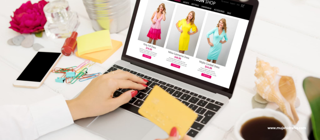
Great product photography is essential for conveying what an item looks like and enticing customers. When it comes to product images:
- Have at least 2-3 photos from different angles or use zooms to show detail
- Lifestyle imagery shows the product in use
- Alternate colour options if applicable
- Consistent image sizes, quality, and style
- Optimize images for fast-loading
- Allow image expansion and zooming
- Include a primary hero image that’s engaging
- Show scale if relevant (person modelling)
- Videos can demonstrate products beautifully
- Let customers contribute photos for user-generated content
- Order images to tell a visual story about the product
Compelling photography reduces doubts, builds confidence about quality, and excites shoppers to own the product. Great images eliminate the need for customers to imagine what an item looks like. They convey key selling points at a glance.
Ensuring Above-the-Fold Content is Visually Appealing
The first impression of a product page has an outsized impact. Effective use of visuals above the fold can capture attention and set the page up for success:
- Lead with the product name, price and a strong primary image
- Ensure supporting images are eye-catching and complementary
- Use colour strategically to create contrast and draw the eye
- leave ample white space between elements
- Utilize icons, infographics and other visuals to communicate features
- Arrange elements cleanly and intuitively – create a visual hierarchy
- Align page sections thoughtfully for smooth scanning
- Balance imagery and text – don’t make it too text-heavy
Making what visitors see first visually striking establishes interest and the right first impression. A clean, uncluttered design facilitates easy scanning. Strong visuals entice scrolling to learn more. Well-executed visuals convey professionalism and build product confidence.
Using White Space Effectively
White space refers to the empty areas around elements on a page. Effectively using white space:
- Prevents a cluttered, overwhelming look
- Guides the eye to important points of focus
- Makes the page feel open and inviting
- Allows key elements like headings to stand out
- Improves scalability and readability
- Conveys visually that the page is uncrowded
- Indicates organization and thoughtfulness of design
- Provides visual breathing room between sections
- Emphasizes images and other visuals
White space eases cognitive load for users by reducing visual clutter. It’s an oft-overlooked element that subtly enhances engagement when done well. Don’t fear empty areas – white space is your friend.

Choosing an Intuitive Layout
A logical, natural layout ensures customers can easily find what they need on product pages. Ideal approaches include:
- Group related elements together – product title/price, image gallery, etc.
- Arrange sections moving top to bottom in the expected order of interest
- Place important info like price and CTA buttons in consistent locations
- Use clear headings and spacing to delineate sections
- Align items neatly into columns for quick scanning
- Put supporting info in sidebars, boxes or accordion menus
- Use a minimal, clean design for a professional feel
- Ensure nothing important is buried – check the mobile layout too!
An intuitive page layout reduces cognitive effort since visitors don’t have to hunt for things. It also builds confidence in customers that they aren’t missing something important. Leverage conventions, but be bold and innovative if it enhances the experience.
Writing Clear, Concise Product Titles and Descriptions
Strong copy ensures customers understand what a product is at a glance. For titles and descriptions:
- Titles quickly communicate the product – include key terms
- Use descriptions to elaborate on materials, uses, specs, etc.
- Address questions and concerns typical customers may have
- Focus on benefits and how the product improves lives
- Use clear, straightforward language – avoid hyperbole
- Maintain a consistent tone aligned with the brand voice
- Write for scannability with subtitles, lists and highlighting
- Check length to ensure descriptions aren’t overly long
- Emphasize what makes the product unique or better
- Use messaging targeted to the intended audience
- Edit ruthlessly to cut fluff – be concise yet compelling
Customers want insights to inform their decisions on product pages – to avoid being dazzled with elaborate wording. Clear, benefit-focused copy builds confidence in the product.
Highlighting Product Benefits and Differentiators
Don’t just state what your product is – convey why customers should care. Successful copy highlights:
- Core benefits and how the product makes life easier
- How the item solves a specific problem or pain point
- Ways in which it improves upon competitors or alternatives
- Unique or proprietary features that add value
- Measurable statistics like “20% faster than…”
- Accolades like awards won or experts recommending it
- User testimonials and ratings that provide social proof
- Any special technology or materials used in making it
- Limited-time perks like free shipping or bonus items
Thoughtfully addressing why this product deserves consideration versus alternatives is crucial. Call out meaningfully better or unique attributes. Back claims up with evidence like stats, awards or testimonials.
Using Persuasive Language
Word choice matters – use language designed to convince:
- Make benefits sound as appealing as possible. How does the product help customers look better, save money, save time, reduce hassle, increase comfort, improve health, etc?
- Address buyer concerns and objections before they arise. Then reassure.
- Use powerful words and psychological triggers like “Breakthrough”, “Proven”, and “Risk-free”.
- Portray using the product as belonging to an elite or savvy group.
- Create a sense of scarcity or exclusivity with words like “Limited supply”.
- Use imperatives like “Add to cart now” and “Claim this offer today”.
- Appeal to the senses with descriptions customers can imagine – sights, textures, sounds, etc.
- Share positive experiences of satisfied customers.
- Provide proof through awards, expert testimony, statistics, etc.
- Leverage flattery and positive reinforcement of good buyer choice.
With thoughtful wording, you can guide customers to visualize benefits and feel good about purchasing.
Optimizing Copy for SEO Keywords
Product copy presents key opportunities to improve SEO:
- Research relevant long-tail keywords customers are searching
- Work primary keywords naturally into titles and descriptions
- Include variants like plurals, synonyms, etc. in moderation
- Create unique, compelling meta descriptions to boost clicks
- Use keywords in subtitles, lists and header tags for prominence
- Include related keywords like materials, uses, industries, etc.
- Mention complementary or accessory products
- Don’t over-optimize – maintain natural language
- Check keyword density is not too high or too low
- Review click-through-rate in search to optimize rankings
Optimizing for keywords people are searching helps pages rank in relevant searches. But subtly weave them in – no awkward repetition. Focus on useful content.
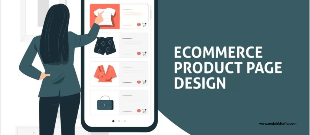
Customers should be able to extract info quickly. Best practices:
- Use plenty of scannable headers, bullets, captions and lists
- Break up long paragraphs – 3-4 concise sentences each
- Call out key specifications like size or materials in bold
- Helpful use of text colour, icons and infographics
- Consistent, clean styling and alignment of elements
- Clear product photos, showing scale if relevant
- Minimal use of extra visuals or text that may distract
- Intuitive page layout – logical content order
- Strong information hierarchy and use of white space
- Clear product navigation and breadcrumbs
Scannability allows customers to zero in on the details most relevant to them. Presenting information well ensures they stick around and buy.
Providing Ample Product Information
Customers require details to make informed purchase decisions. Ensure you provide:
- All relevant technical specifications are presented
- Size, materials and care instructions
- Options for customization like colour, size or configuration
- Clear guidance if assembly or installation is required
- Comparisons to previous models, if applicable
- Details on included items, accessories or refills
- Warranty and customer support information
- Company policies around returns, exchanges, etc.
- Nutritional information or ingredients, if applicable
- Instructions for safe use if relevant
- Compliance with applicable regulations and standards
The more confident customers feel in how well a product is explained, the more likely they will buy. Address common questions proactively.
Using Calls-to-Action Effectively
Well-designed CTAs spur visitors to purchase:
- Primary CTA is a distinctive button – “Add to Cart” is ideal
- Make button copy strong and action-oriented
- Use complementary CTAs for wish lists, subscriptions, etc.
- Ensure buttons stand out visually with colour, size, etc.
- Place primary CTA in a consistent spot – often under buy options
- Include CTAs in multiple locations throughout the page
- Link “Buy Now” buttons straight to checkout
- Reduce steps to purchase – don’t make customers hunt for add-to-cart
- Test alternate wording for buttons – “Shop Now”, etc.
- Prompt urgency with terms like “Limited time offer” if applicable
- Include supportive buttons for questions, help, or subscriptions
Strategically placed, visually bold CTAs remove friction in the conversion process. They transform interest into sales.
Optimizing Page Speed and Mobile Experience
Slow-loading pages negatively impact conversions. To optimize:
- Streamline page design and avoid unnecessary visuals
- Compress, resize and optimize images
- Leverage browser caching and other speed best practices
- Defer loading of non-critical elements
- Minimize HTTP requests and external files where possible
- Enable compression of CSS, JavaScript and HTML
- Replace animations with CSS transformations when feasible
- Verify that the page is mobile-friendly and renders nicely cross-device
- Simplify design elements on mobile to minimize scrolling
- Check speed metrics regularly and address bottlenecks
With site speed directly impacting revenue, product pages must be swift and responsive. Customer patience is limited – optimize for speed.
Conducting A/B Tests on Page Elements
A/B testing different versions of page components provides data-backed optimization:
- Test alternate product titles to see which resonates best
- Experiment with different main image options
- Try tweaking call-to-action button wording and placement
- Vary page layouts and section ordering
- Compare different text lengths and levels of detail
- Evaluate the impacts of optional content like videos or tabs
- Attempt introducing or removing elements like customer ratings
- Check the impacts of changes in typography, colours, styling
- Measure results not just on CTR but further funnel conversion
Small changes can have big impacts on metrics like CTR and conversions. Let data guide design choices – not just assumptions.
Analyzing Site Metrics to Identify Issues
Key metrics to analyze regularly:
- Bounce rate – high means poor engagement
- Pages per session – more is better
- Average session duration – lengthy is good
- Conversion rate from session to purchase
- Organic traffic and search rankings
- Device and browser breakdown – is mobile optimized?
- Form field dropout rates – where do they abandon?
- Click tracking on-page elements – what draws interest?
Dig into metrics across sessions, pages, forms and elements. Identify weak points like poor mobile rank. Set measurable goals, then track progress.
Continuously Optimizing Based on Data and Feedback
Product pages demand ongoing optimization:
- Review metrics frequently and fix issues
- Monitor search rankings and improve based on SEO data
- Leverage user testing to identify areas for improvement
- Analyze on-page behaviours with click tracking to optimize
- Monitor reviews and FAQs to improve info provided
- Check mobile layouts on multiple devices
- Refresh page design periodically – don’t become stale
- Test new components like videos for potential lift
- Talk to customers directly for subjective feedback
- Verify details like specs stay up-to-date
- Watch competitors and industry best practices
Optimization is not a one-time task – it’s an ongoing process. Continual incremental improvement over time yields results.
The Purpose of Product Pages
The goal of any product page is to effectively communicate what your product is, who it’s for, and why customers should buy it. A good product page acts as a salesperson, addressing potential customers’ key questions and concerns and convincing them to purchase.
At its core, an ecommerce product page needs to explain three things – what the product is, what it does, and why the customer should care. You need to briefly describe the product’s features and benefits, help customers understand how it will solve their problems or improve their lives, and prompt them to take action by purchasing.
An effective product page both informs and persuades. It should educate customers about the product while also influencing their buying decisions. The page copy, layout, images and calls-to-action should all work together to convince shoppers to add the product to their cart.
Essentially, it is a stellar product page, marketing material, advertisement and sales pitch all rolled into one. It’s often the first and sometimes only chance to make your case to customers, so the page needs to convey the value proposition quickly and compellingly.
FAQs
Q1: What are the most important elements of a product page?
The key elements are strong images, an informative but scannable description, details on features and specs, pricing/options, and clear calls to action.
Q2: How much text should be on a product page?
Less is often more – keep product descriptions short and sweet. Let the images tell the story and use text to inform.
Q3: How can I make my product page stand out?
Use compelling images, focus on unique benefits, include multimedia, and optimize for a great mobile experience.
Q4: Should I include customer reviews on product pages?
Yes, reviews and ratings provide essential social proof and credibility. But keep them concise.
Use action words like “Add to Cart”, make them visually stand out, and place them strategically near the purchase options.
Q6: How often should you update product pages?
Continuously – refresh content, images and design elements regularly to keep pages engaging.
Conclusion
Creating an exceptional product page is a multifaceted endeavour that requires carefully optimizing visual design, compelling copy, user experience and continual testing. However, the effort pays dividends through higher conversions and sales.
Starting with strong, attention-grabbing images and headlines, you must briefly explain the product and highlight its benefits. The page copy should use persuasive language to convince customers why they need this item. An intuitive, uncluttered layout with ample white space facilitates easy scanning.
The focus should be on addressing visitors’ questions and pain points. Providing ample detailed information builds trust, while clear calls-to-action drive conversions. Continuously test and refine page elements, analyzing metrics to optimize.
The goal is to craft a page that both informs and sells. An effective product page is an ambassador for your brand and your product. Take the time to make it exceptional; it will pay rewards through satisfied customers and increased sales.
Boost Sales With Better Product Pages! Get Free consultation now
Read More:
The Next Trending Products For Shopify Ecommerce| Experts Journey


